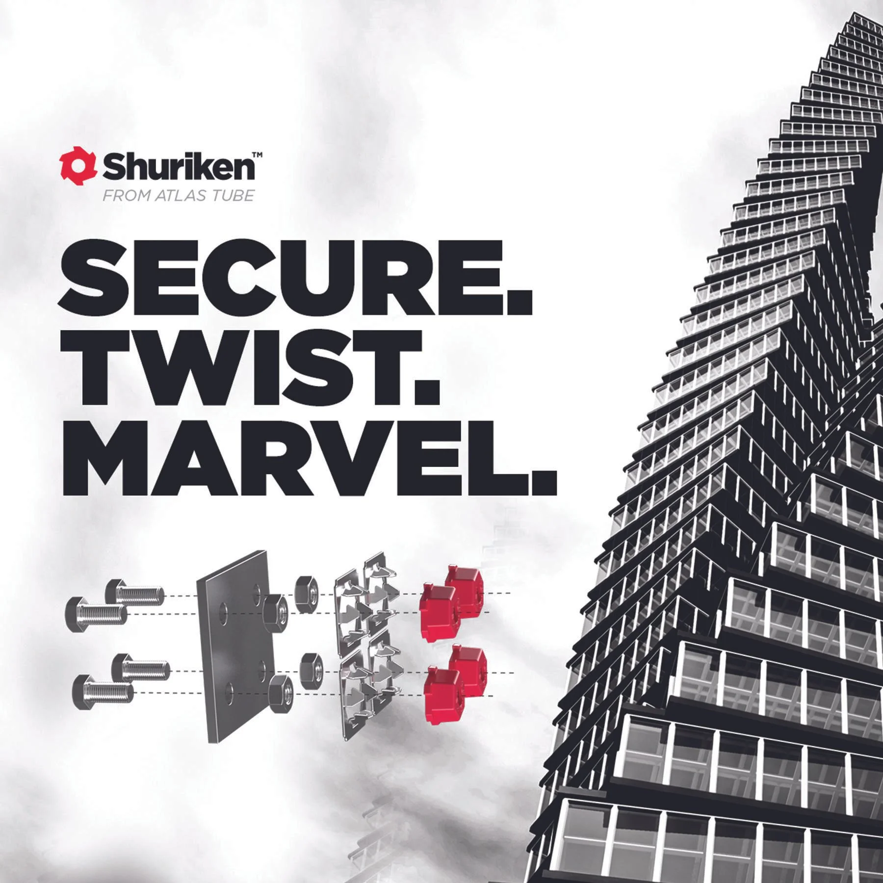
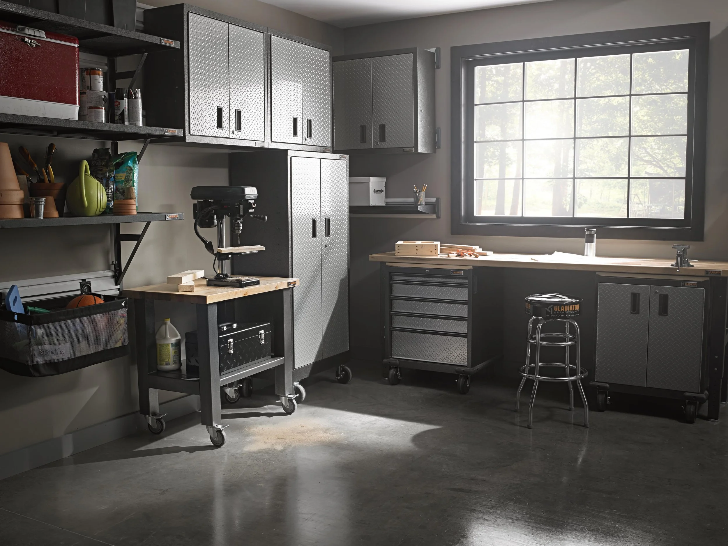
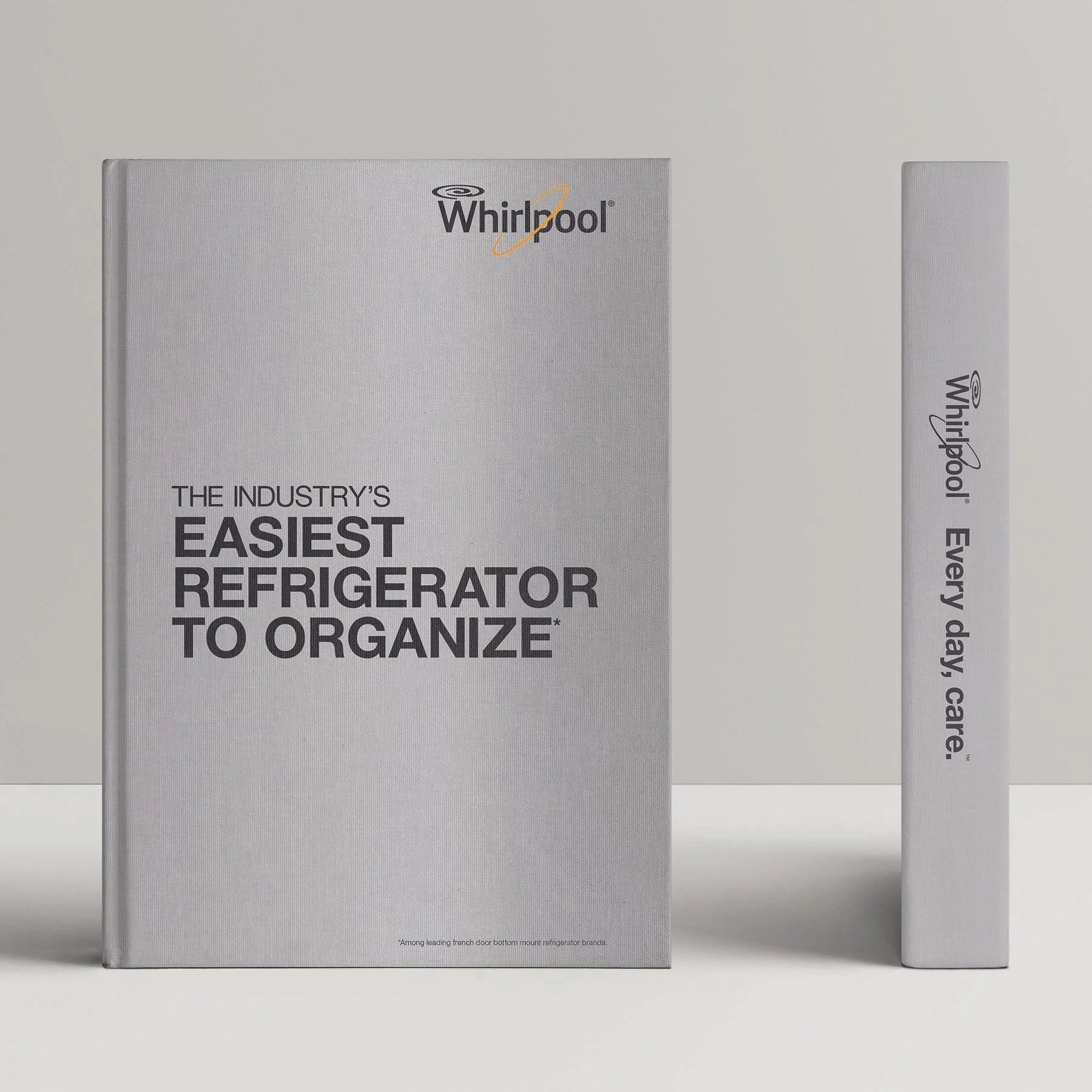
Your Custom Text Here
Gladiator home page refresh designed to minimize load time and enhance the shopper’s experience with a simplified navigation and a more product-focused user experience.
Updated promotional element strategy including banners throughout the site, emails and social posts.
(Home page design is not the final concept).
This pop-up book was developed as a training guide for sales associates in the appliance department at Sears. The goal was to educate the associates about the features and benefits of the new line of Whirlpool refrigerators in an interactive and memorable format.
Pull up the card to reveal different messages that pass through the cutout window.
Pull the tabs to reveal loaded refrigerators (the same items shown in both to highlight capacity/storage benefit).
Three bottles pop forward, anchored from the bottom of the page.
Lift flaps to reveal filled bins and messaging.
Two door bins pop forward.
Pull tab to reveal lenticular image change.
Unroll barrel fold to access pull-tab image reveals. Spin the wheel to reveal step-up information.
This display was designed for a Maytag kitchen end cap at Best Buy. The end cap introduces the new fingerprint resistant stainless steel suite and uses premium materials and lighting to create stopping power within Best Buy’s technology-saturated shopping experience.
The header utilizes dimensional, backlit elements for branding and recessed lighting to illuminate the microwave and range. A lenticular was proposed to add motion to the Maytag Man, animating his legs to imitate running in place.
This kit was developed to support the launch of smart products for Craftsman and Kenmore brands. The materials were created to educate associates on the product lineups and their connected capabilities. Products included tractors/mowers, garage door openers, tool chests, water heaters and water softeners.
The kit included a training guide, feature-a-minute cards, and a pocket guide for quick reference.
The New Balance 574 experience brought a customization touchscreen interface to life in the Foot Locker in Times Square. The touchscreen was housed in a display that featured materials, inspiration and design information to guide users through the process.
The experience was supported with a window display featuring an oversized lenticular shoe and dimensional stitched messaging. The display was later reworked for the New Balance flagship stores in Boston and New York.
AWARDS
2013 MarCom Awards
Platinum (ads/point of purchase)
2014 Hermes Creative Awards
Platinum (new category)
2014 Hermes Creative Awards
Gold (point of purchase)
2014 A.R.E. Design Awards
Store Fixture Award
2014 Hub Prize
Bronze Award
2014 Pro Awards
Honorable Mention (best in-store retail campaign)
This in-store activation was designed for New Balance's NBWOMEN catalog launch. The story brought the catalog to life throughout the shopper journey — from digital activations through the shopper experience, including window and table displays.
The window displays and in-store materials were developed to showcase New Balance's proud history of products that are made in the USA.
Dimensional textile designs were used as a nod to craftsmanship and to evoke imagery of stitching and shoelaces.
Digital and in-store materials were designed for the launch of the VAZEE shoe collection at New Balance stores.
The New Balance “Court” and “Weekender” Collections required photo shoot direction and printed materials for an international campaign.
This set of in-store displays featuring Troy Polamalu was designed for the Head & Shoulders men’s collection.
This mailer and microsite was designed for a Father’s Day promotion for Craftsman C3 tools.
The campaign was run through VocalPoint, a word-of-mouth marketing platform from P&G.
AWARDS
2011 W3 Award
Silver
2011 MarCom Award
Honorable Mention
This desktop and mobile site design was created for Cooking With Kraft, a Kraft Foods initiative at Publix.
The simple landing page was updated weekly with in-store promotions and recipes.